Ohio University’s campus is looking a little different recently. The sides of many academic buildings and dining halls have been emblazoned with large green and white decals that remind all students of many messages that OU wants to get across.
The pride of being a Bobcat and the quality of the education here are two potential inspirations that the new decals really hone in on. However, some of the new additions to the buildings sort of tamper with the “Harvard on the Hocking” aesthetic that the stunning brick architecture cultivates. And, with that, it can also make it feel like you are living in one giant advertisement while you are walking around campus. With all the mixed feelings about these new decals, here is a comprehensive ranking of which ones look the best and which ones are more of an eyesore:
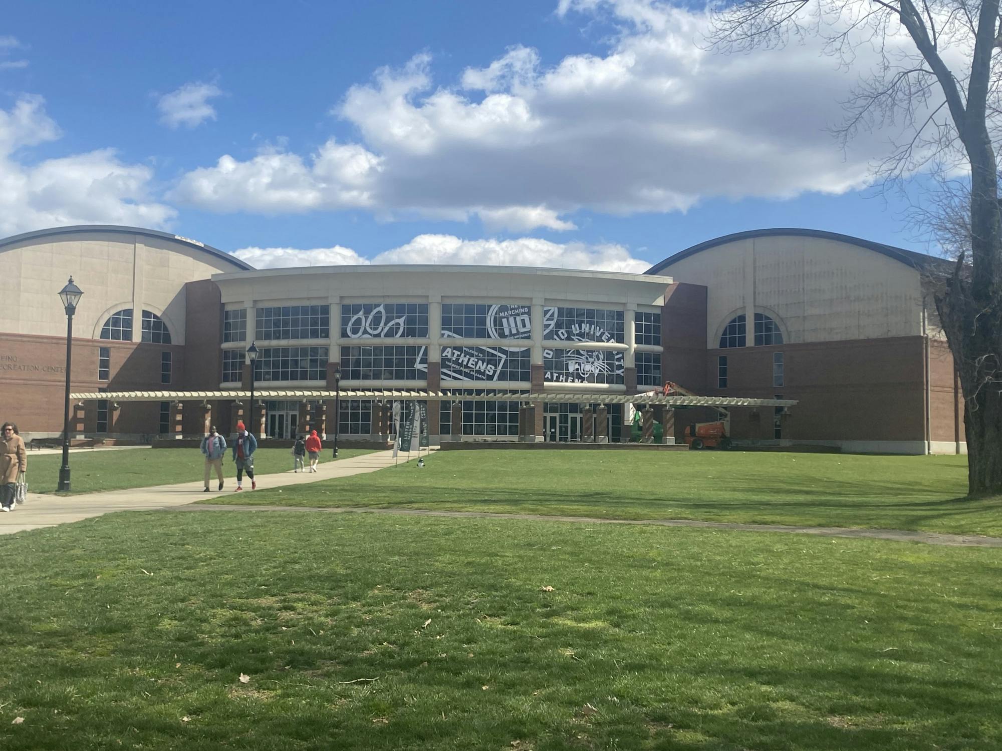
1. Ping Recreation Center
This one is fairly inoffensive. The designs aren’t too bold, and the choice to make them all white helps them look clean and not out of place against the already muted colors of Ping. The patchwork placement of the design also resembles the travel stickers that people would put on luggage. Overall, it is a nice aesthetic addition that feels like its placement enhances the building even more. However, it could be quite annoying when your are doing a 12-3-30 workout at a treadmill by the window and have to stare at a big white block instead of the nice view of campus outside.
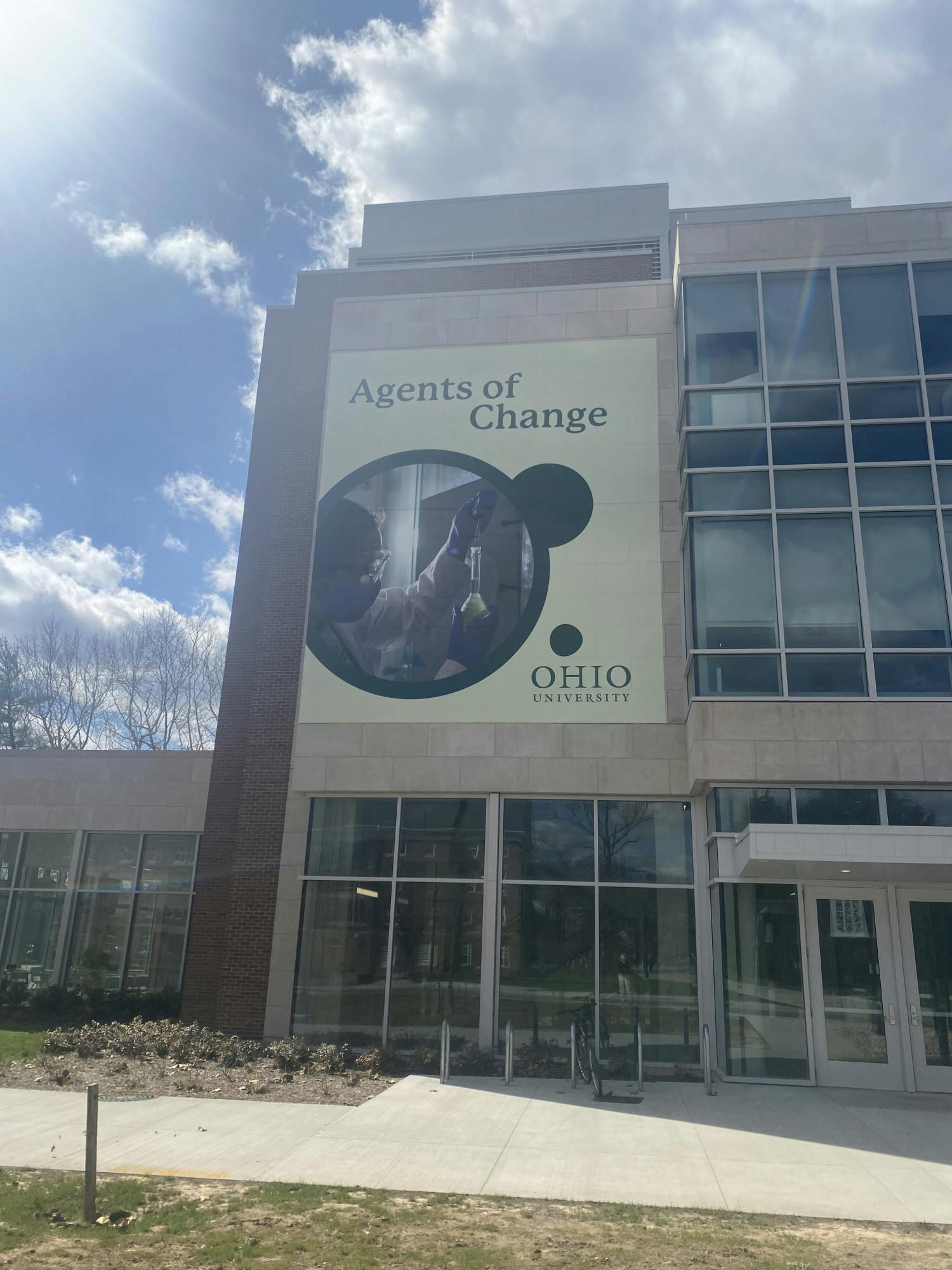
2. Clippinger Laboratories
The shade of green chosen for this decal is absolutely perfect. The color fits much better with the gray concrete exterior of the building than a dark green would. The phrase “agents of change” is just beyond corny, though.It’s a bad play on words that everyone now has to groan at when they are simply trying to walk home from Nelson Dining Hall or are on their way to Baker.
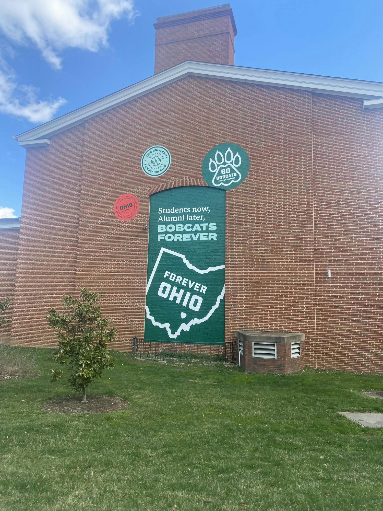
3. Nelson Dining Hall
Speaking of Nelson, the phrasing on this decal is simply hilarious. Obviously, we are all “Students now, Alumni later.” Is that not already obvious to every single person in attendance here? Especially for rising graduates right now, this isn’t making their soon departure any easier. A better phrase would be "Bobcats Forever” to make this a more united message. The little circles around it are fairly cute, but it’s confusing why they aren’t green or white like all of the other decals.
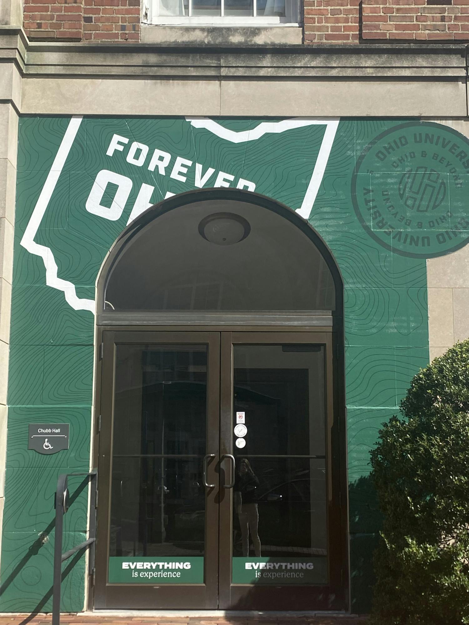
4. Chubb Hall Doors
While these details are designed very well, their placement ruins their purpose entirely. Placed near the Chubb Hall doors facing Court Street, these decals have an awkward presence that takes away from the classic look of the academic hall. When it was first put up, it read “Forever OHHIO” and now it just reads “Forever OH-“ The latter has more relevance to Ohio State, not OU.
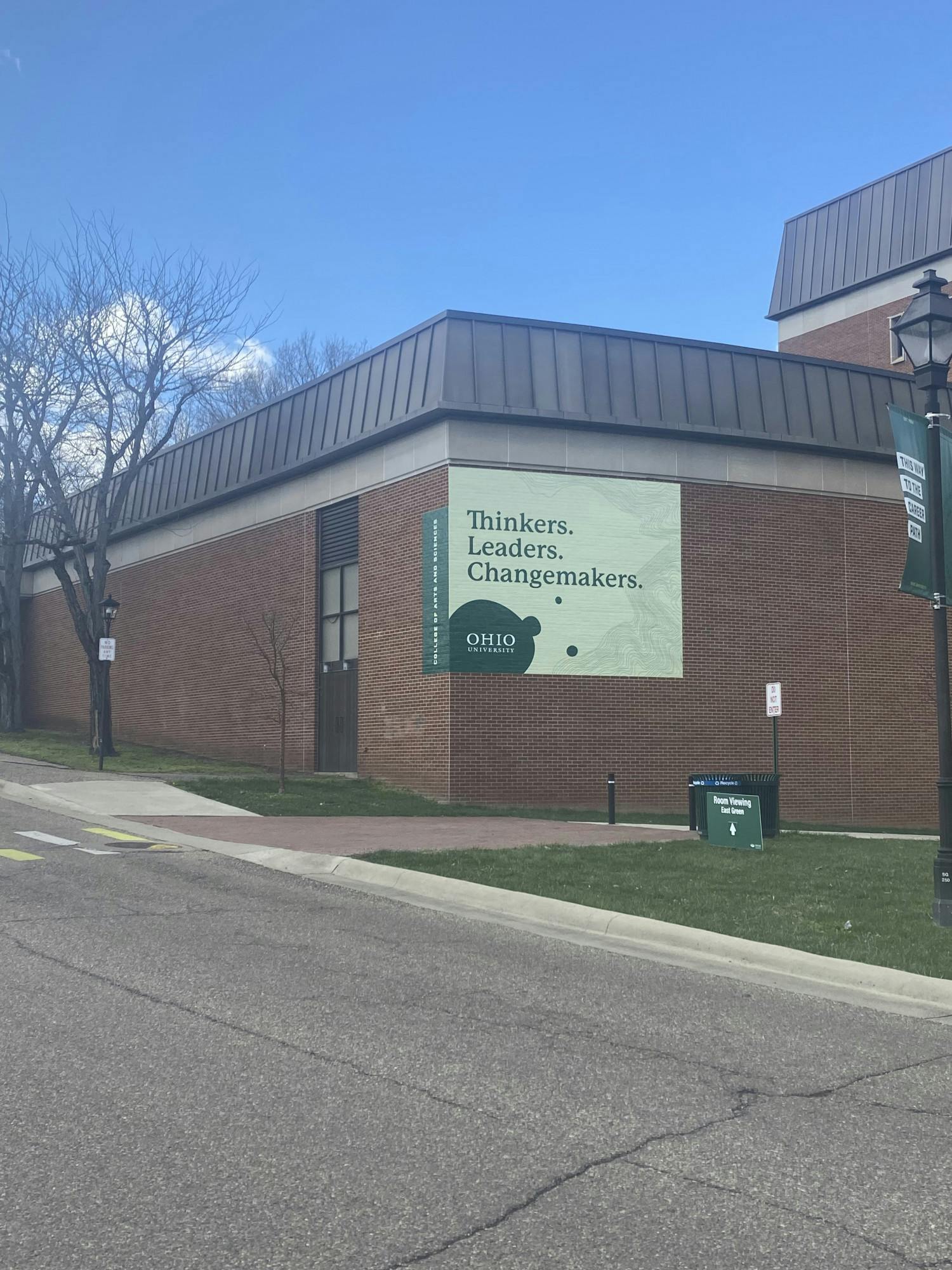
5. Morton Hall
Two decals with the same message, right next to each other, feels pretty redundant. This one on Morton Hall is fairly small, so it isn’t too much of an eyesore overall. It would have been nice to see a lot more intention behind this lackluster design. Especially since this particular building is highly populated by underclassmen, connecting a message about new beginnings would have been a more genuine design idea.
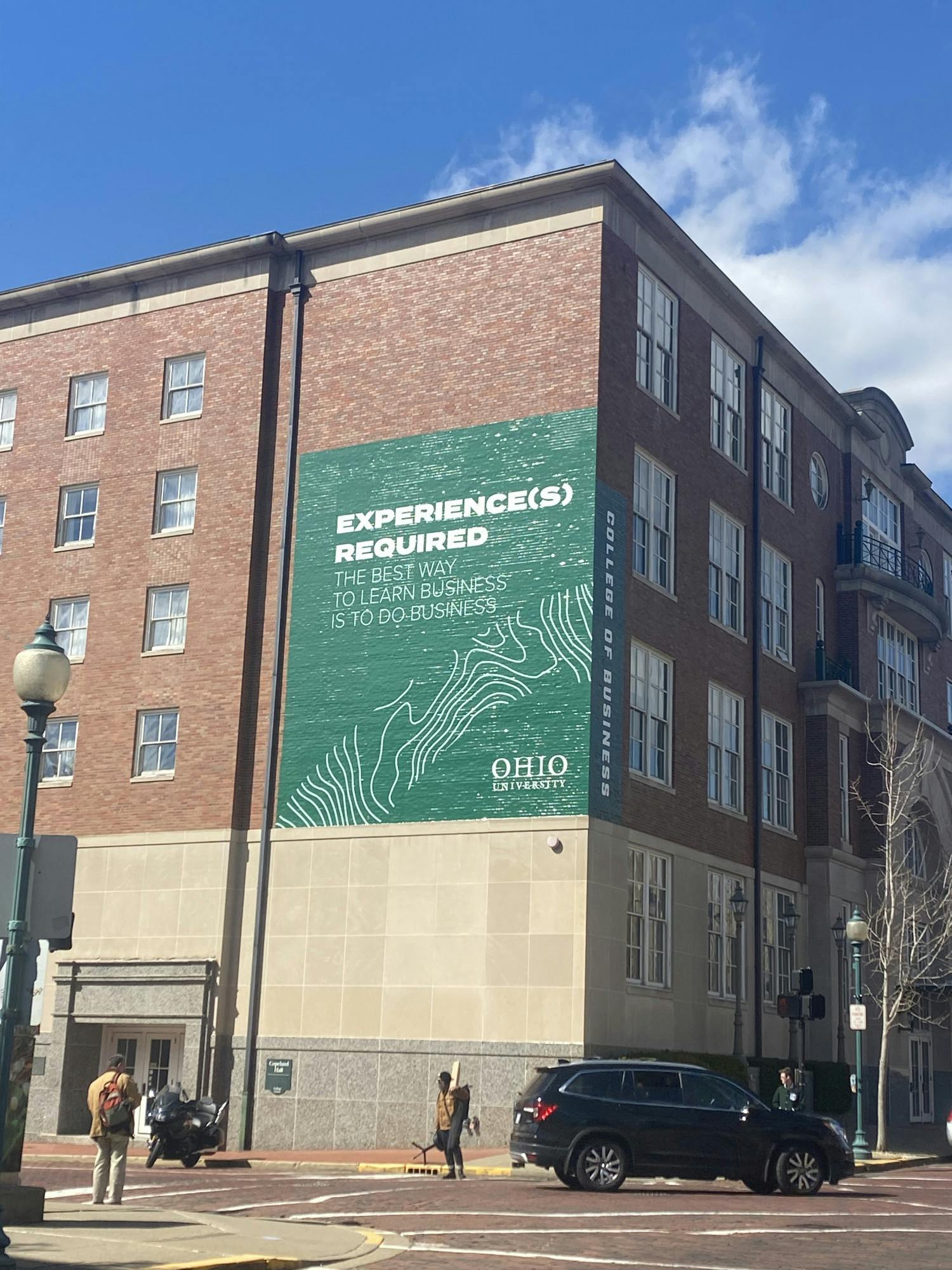
6. Copeland Hall
“Experience(s) Required” is the most eyeroll-inducing phrase that could have possibly been chosen to go on this decal located on Copeland. Even so, this design is absolutely humongous and does not look flattering plastered on the side of Copeland, a hall that is very visible from lots of places throughout College Green and Court Street.
Managing Editor